I have been comparing various contents pages and found some good and bad.
1.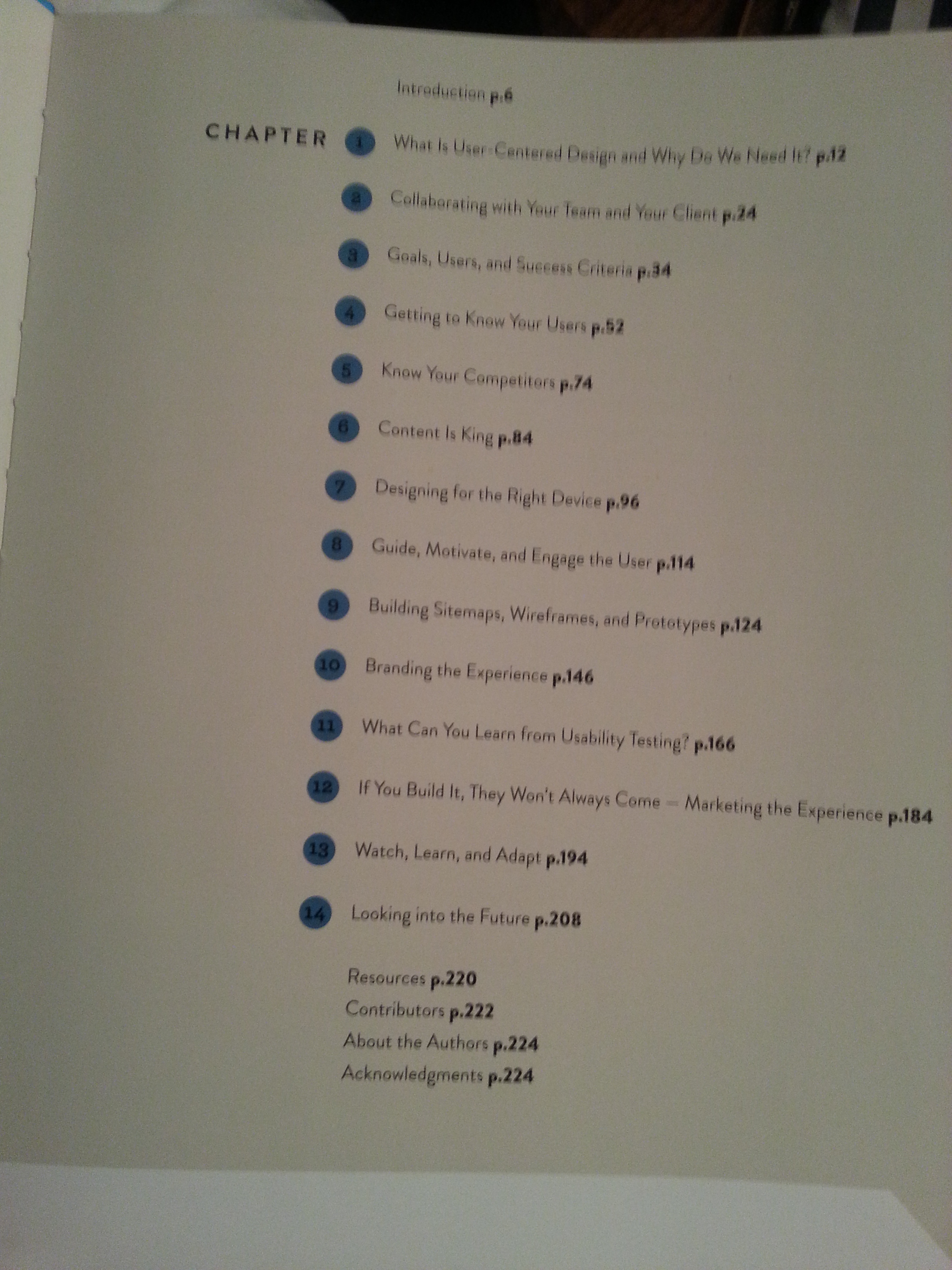

This table of contents page is really interesting to me. I really love how the numbers are in circles, instead of just by themselves. It really add’s a nice overall look, sort of like bullet points. I also like the typography used within this contents page because it’s not overly large and cluttered. It is nicely spaced out, and I love the roundness to the type. This contents page has style, as well as being easy to read. The text is very centred, with it being flush left.
2.

I love the Sims, and so I decided to display this contents page. I honestly don’t like it. In my opinion, I think it looks very boring but it is very simple and straight forward. I would understand why they wouldn’t go all out on a contents page for a game guide. In terms of typography, I don’t mind it. It is legible and simple, with a fair amount of space between the lines.
3.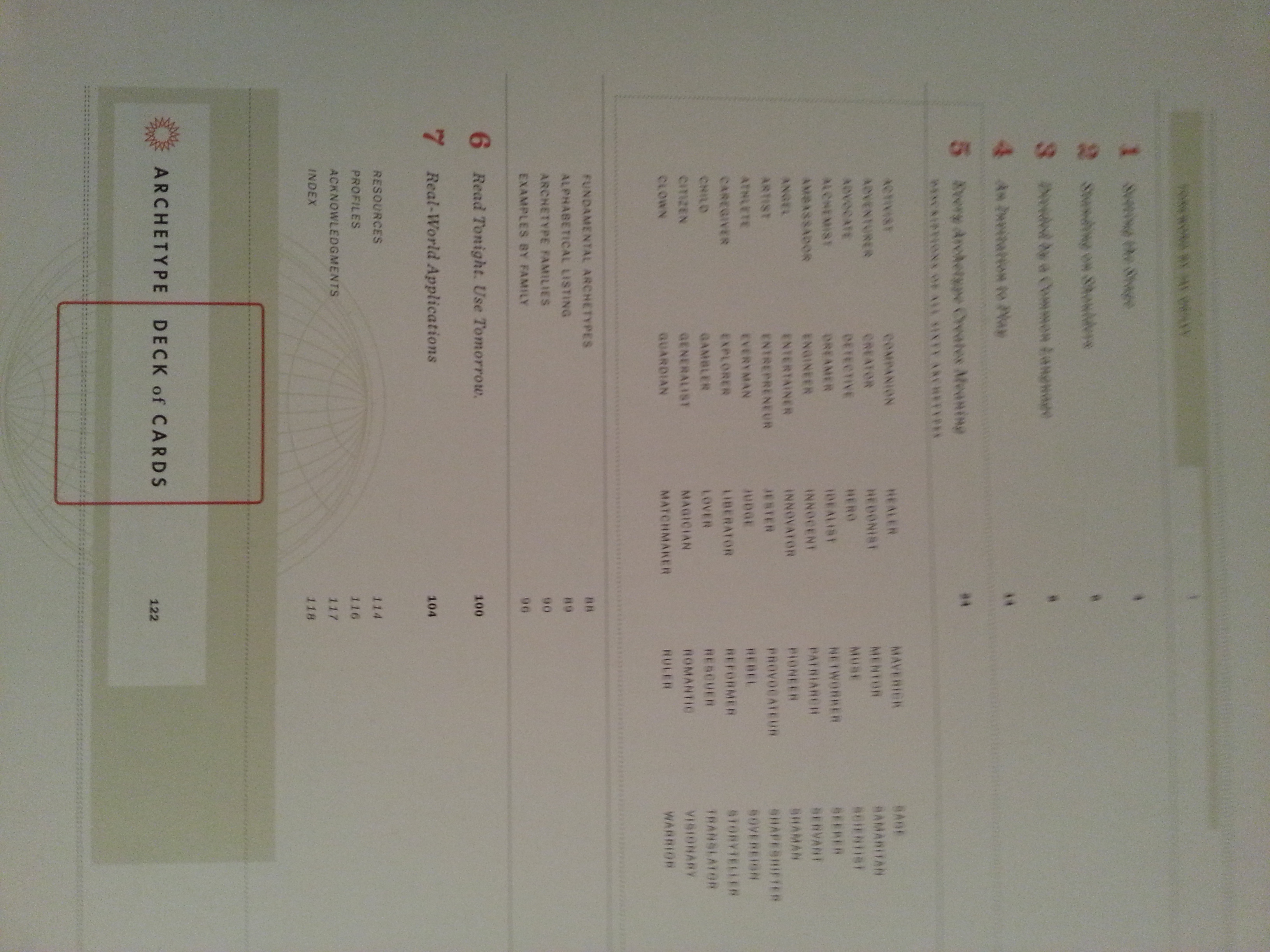

This contents page is from “Archetypes in Branding”. I would say this is one of the most interesting contents page I have seen so far. It is just so uniquely designed with the pale colours and lines. I love the use of bright orange, it really makes the numbers stand out. The typography is very simple with the use of a regular, and italic styles of fonts. The boxes around the type is very effective and works well with the overall design. The use of columns, being flush left makes is very organized and easy to understand as well as being very well designed with the lines, boxes, and bright colours.
4. 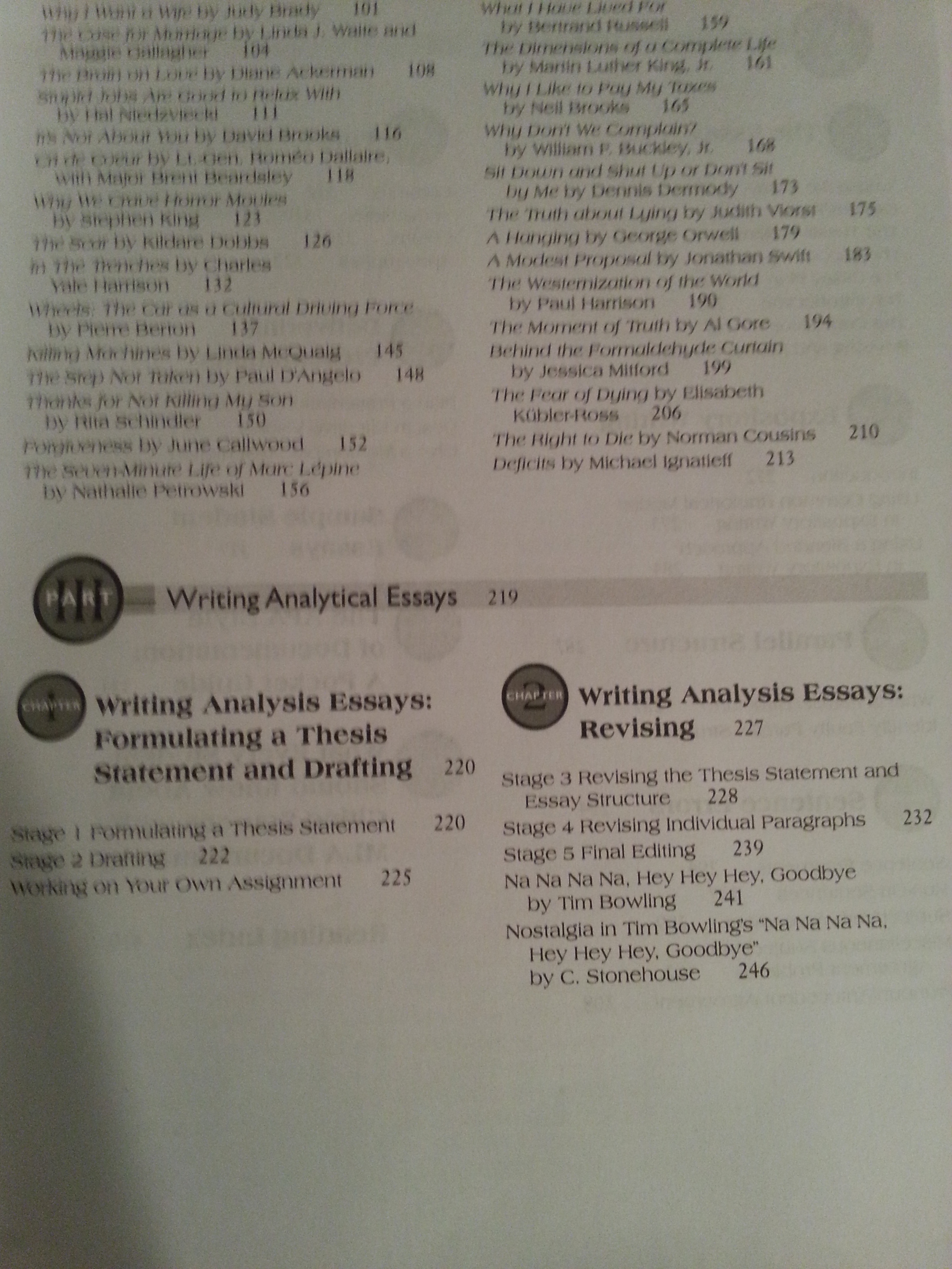
This contents page is from the comm 170 textbook. It is fairly large and is organized well. In terms of the overall design it seems quite interesting. I like how they had put the number and the part and chapter inside the circle as well. It is fairly unique and I have never seen it done before. It does save more space for other information across the page. Also, the use of the thick lines really impacts the design, making it very organized. The information seems very tight, and my only issue with this is the page numbers and spacing.
