So, I have been working on a series of posters and I have decided to make them interactive in a way where people can help spread the word about the Spiritual Evolution!


What I have done here is left the middle blank so other people in the public can express their concern in a creative way. Wether it’s graffiti art or simply marker.
Here is an example:

These posters are going to be large, spread across building, in subways and public areas.
For the posters I added little illustrations that relate to the topics. I love pen and ink art to I wanted the illustrations to have that feel and these are brushes that I put together in photoshop. I want the posters to have different events in each category. For example, the poster with earth will not just be on deforestation, it will focus on other aspects as well, in separate posters all with the spirit wolf stamp on it to categorize it.
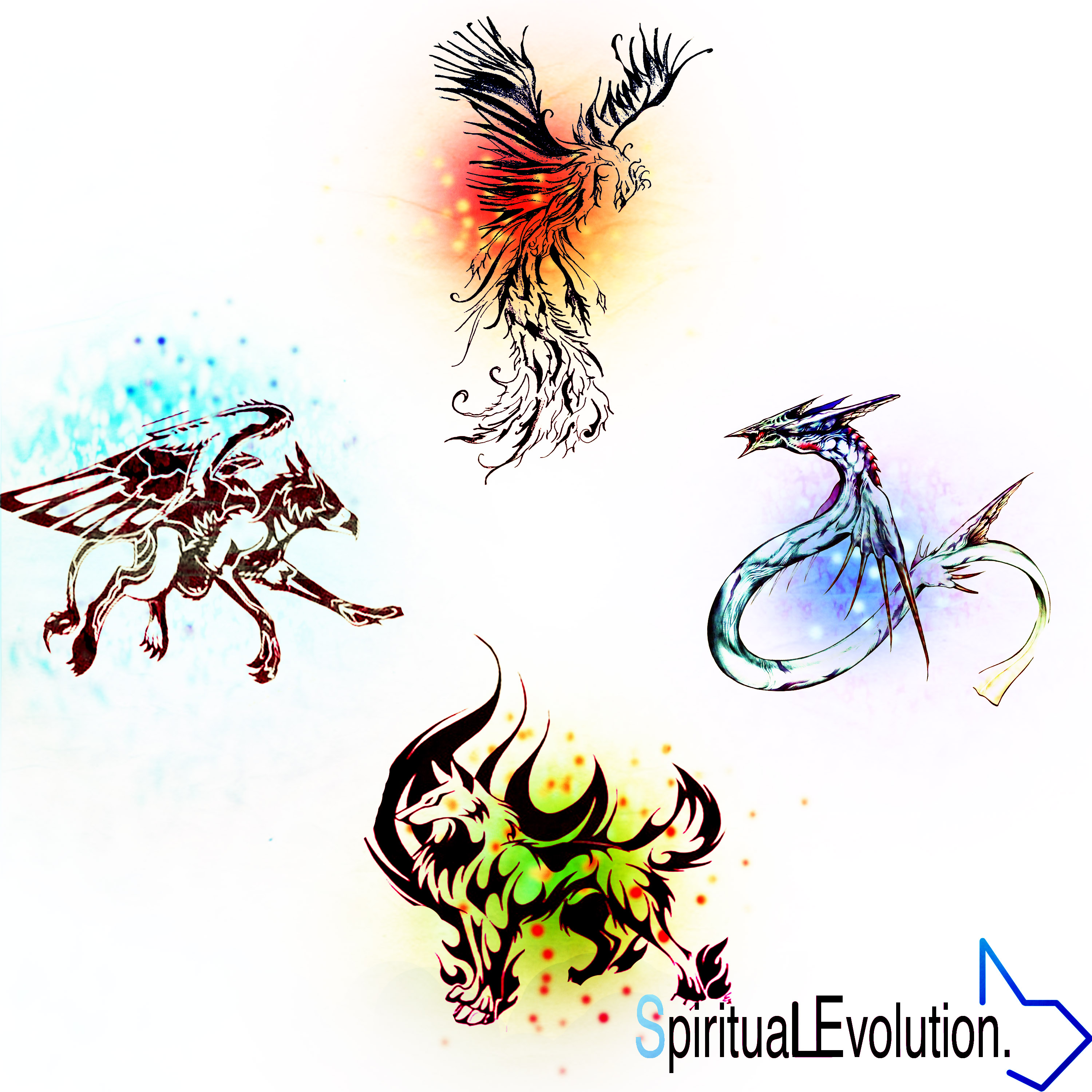
The first poster I have here is the Wind element. For the illustration I have A pair of wings shaped like a heart in the sky to represent the “love” for the air we breathe. It needs to be clean and pure, especially for healthy minds. This brings about the topic of air pollution.
The second poster is Water. The illustration here are waves. This represents many things. Water relates to emotion because everyone has their ups and downs and theres never guessing how someone feels every minute, just like the waves in the water. Water pollution also plays a role with this. which is talked about
The third poster I have is Fire. The illustration in this one is the sun, with the moon inside of it. The sun gives us life on earth, it is also spiritual, especially for spiritual purposes. Many religions use the sun as their god. The sun creating life. The environmental aspects include uv radiation and the affect.
The fourth poster that I have created it with the earth element as you can see, which represents “body” The illustration is a tree, with visible roots below. This brings up the topic of deforestation. The roots being visible are significant because it symbolizes the tree coming out of the ground and being eliminated.
Another part of the campaign are booklets, (As i mentioned before) they are designed similar to the posters because when people view them they know what they are about. Inside the booklets will contain images set in a timeline. From positive to negative. For example, for the booklet on earth, the topic may be deforestation. The beginning will show bright, luscious forests and animals, as you keep flipping the book it depletes more and more and the colour fades away.
Here are some samples of the book covers which look identical to the posters:


The goal for these booklets are to inform people visually, of what is going on around the world, how it affects ourselves, spiritually, mentally, emotionally and physically. And how it affects the earth in various aspects.
As you can see I have two logo’s on the bottom right of the booklets.
Explanation of the two different logos:
![]()
(For the logo on the right, Leigh suggested that I change the background to a solid white. The rest of the logo stands out more which I like better).
So… The reason why I chose to have two separate logo’s (besides the fact that I couldn’t choose one) is to emphasize the positive to negative and light to dark. The environment is always talked about. Mostly in a negative way and I want to approach it in both positive and negative. Looking at the bright side of things when we help our environment and ourselves as humans. And looking at the negative impacts on the environment and towards ourselves.
With the insert of the two various logo’s on the book covers It show’s that the books will all explain the positive and negative effects towards ourselves and the environment.
